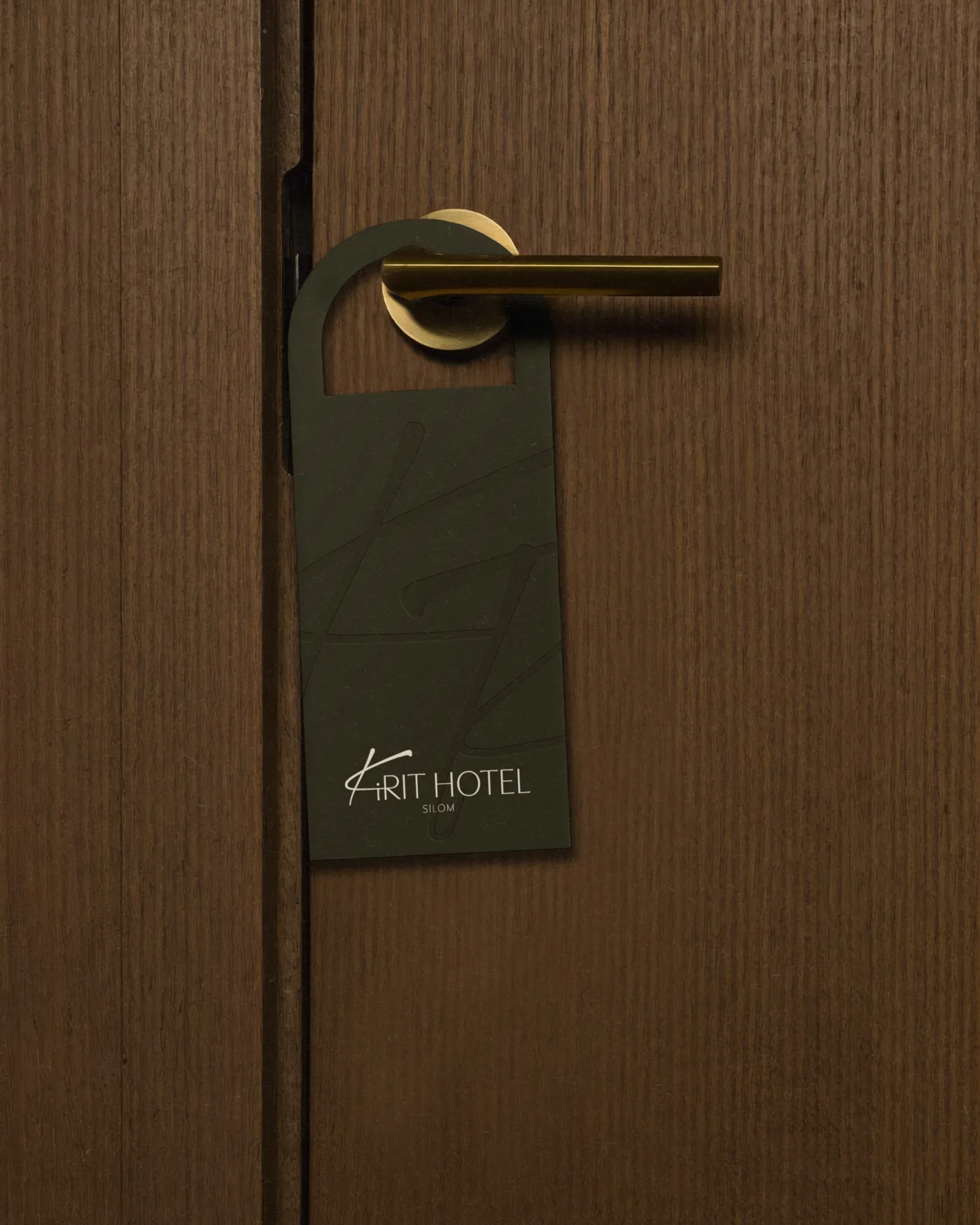
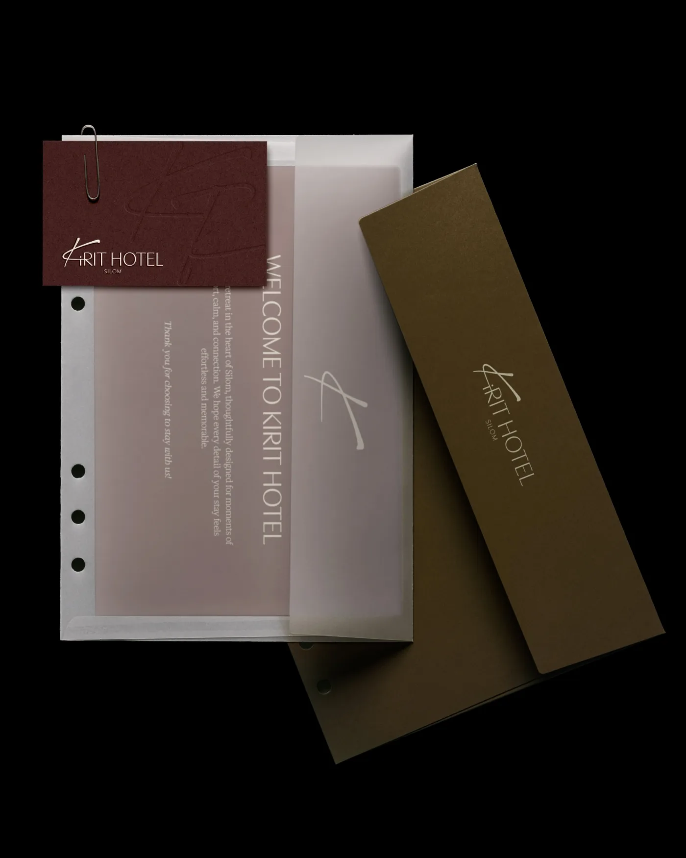
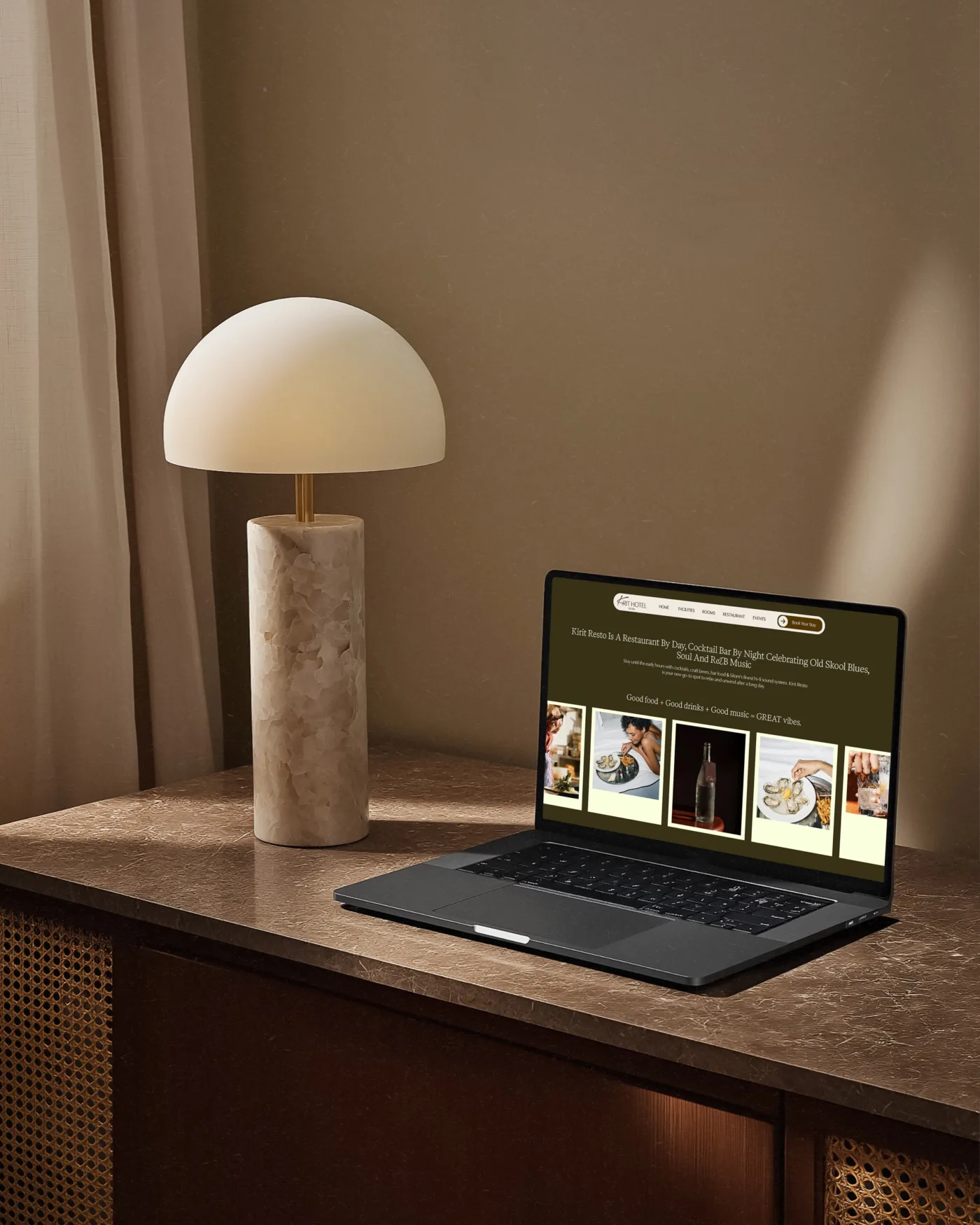
Kirit Hotel
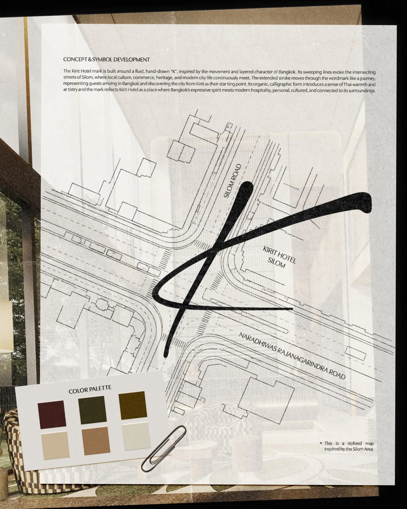
Location was a big part of Kirit Hotel’s identity from the start.
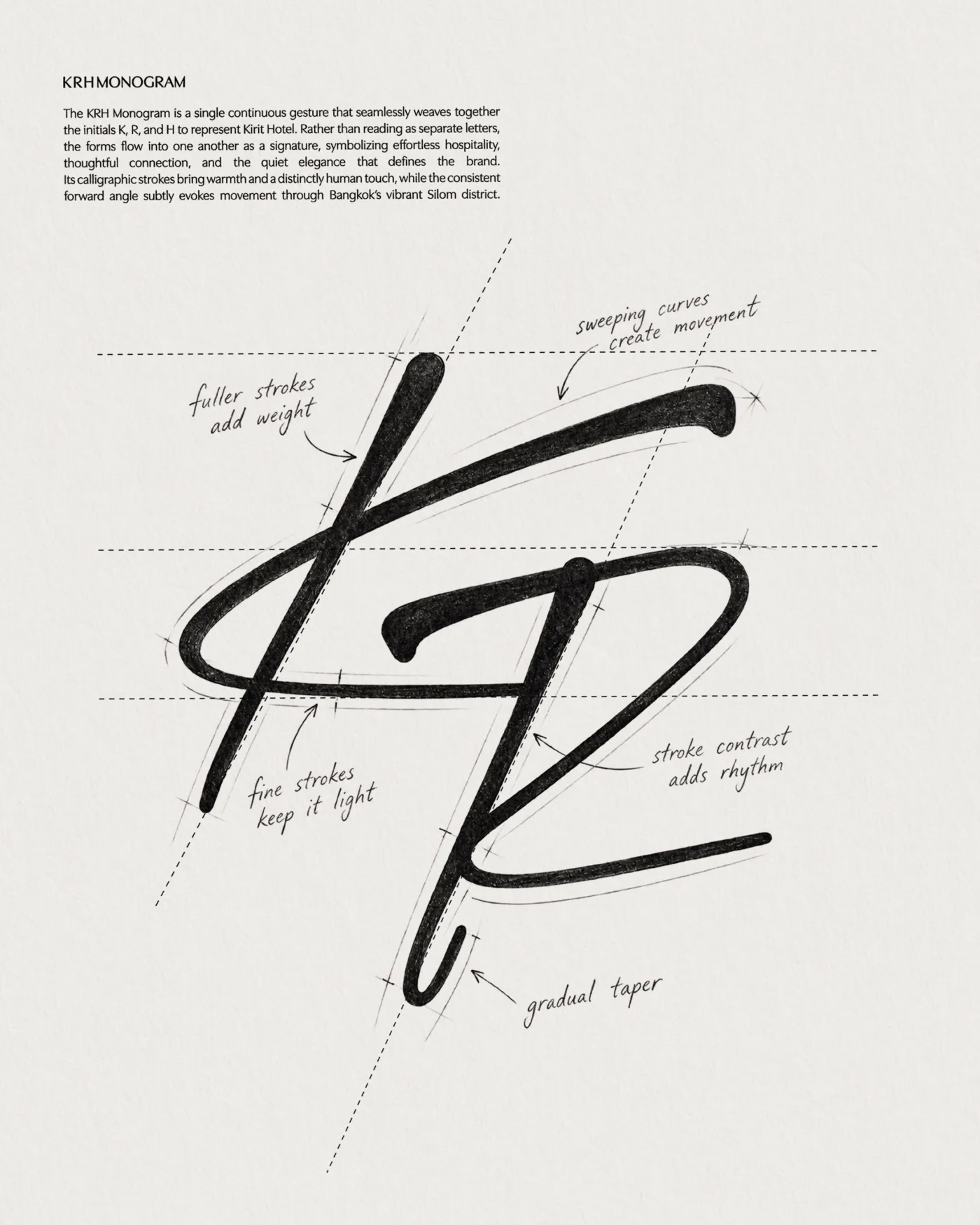
Sitting in the heart of Bangkok, right next to a four-way intersection, we took inspiration from the many paths and directions that meet at this one point.
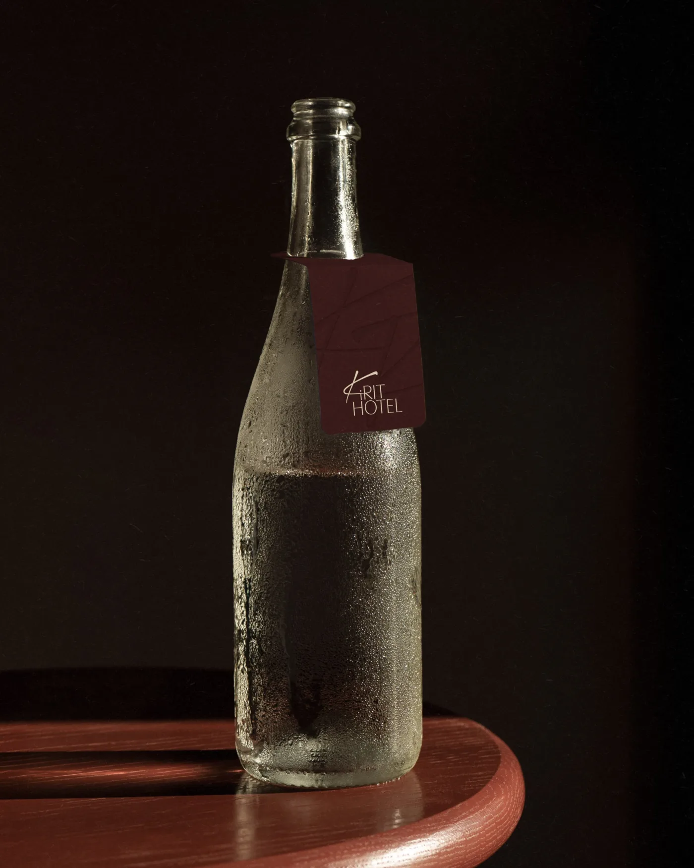
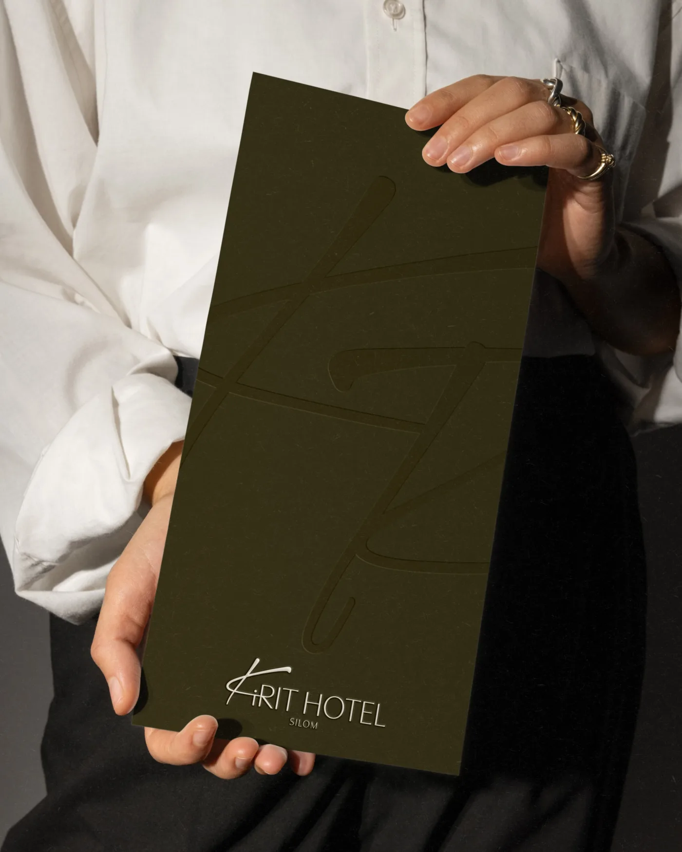
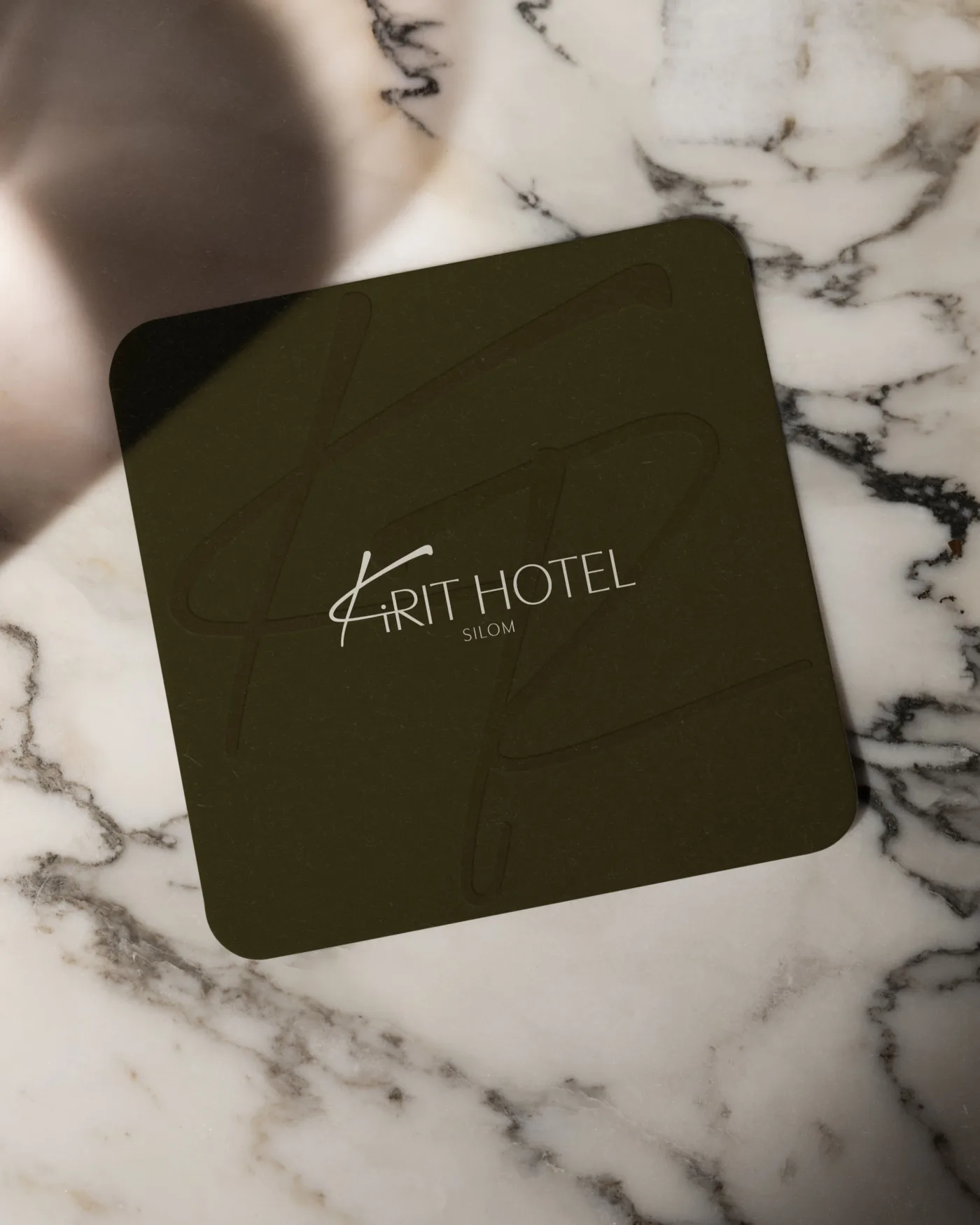
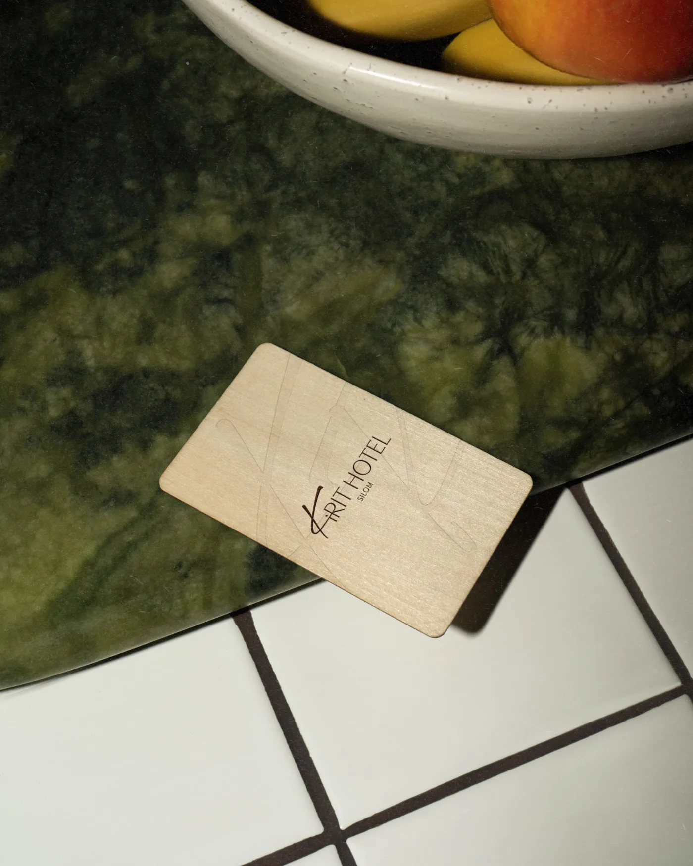
This became the idea behind the strokes of the K — each line representing a different way of arriving, crossing paths, and finding your way to Kirit.
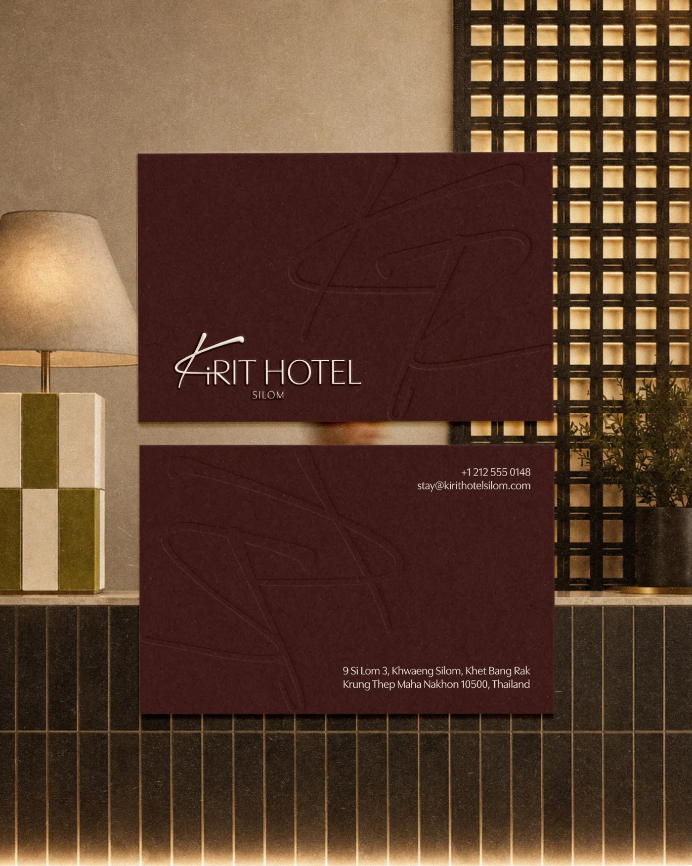
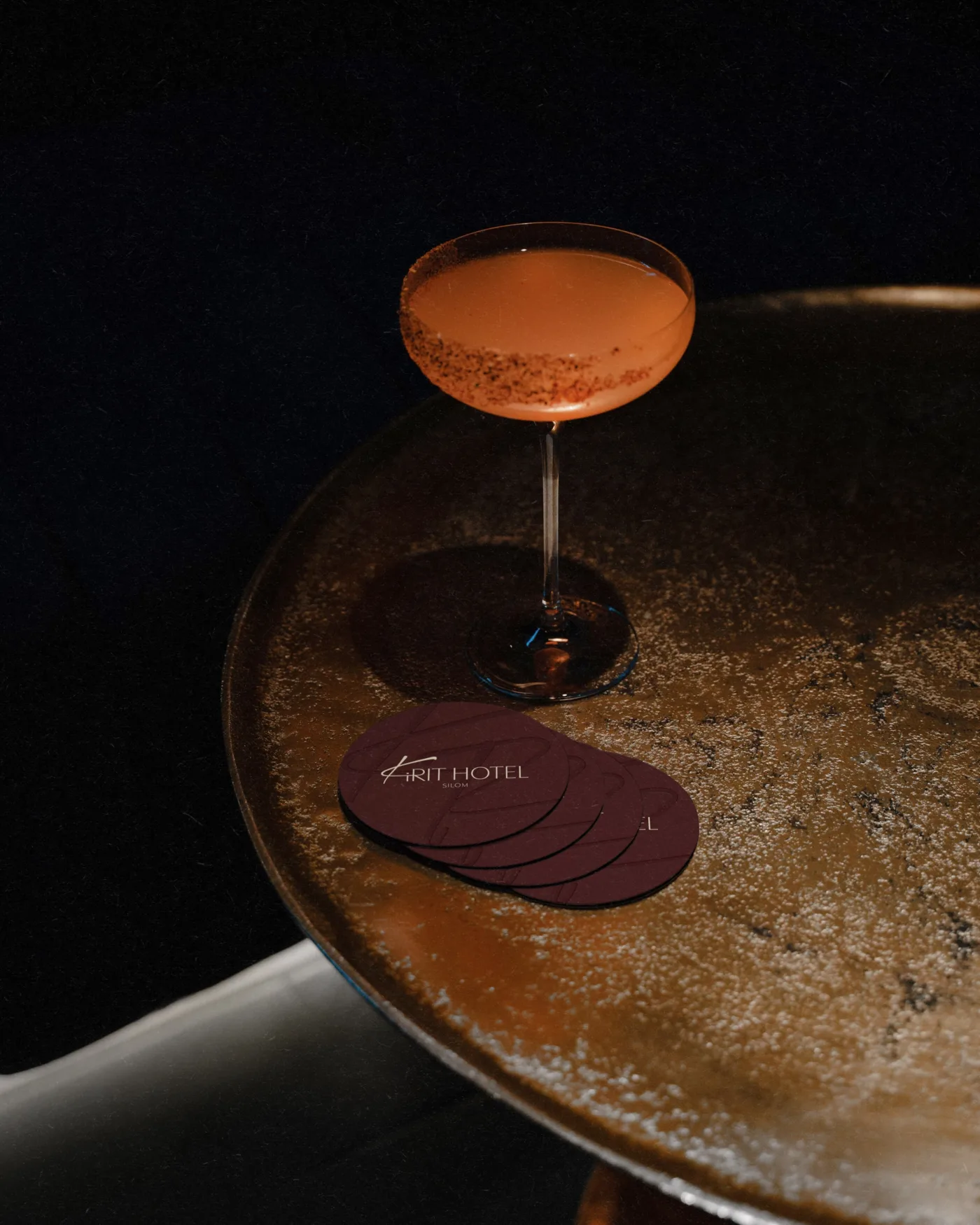
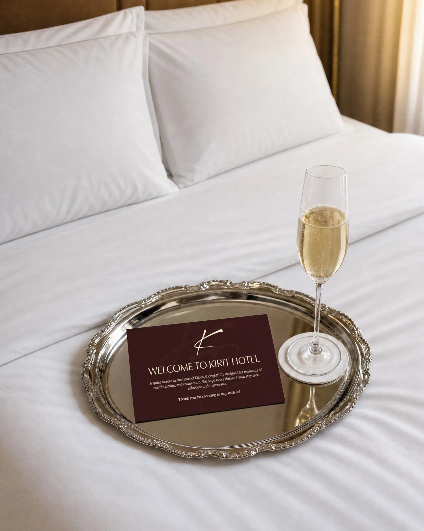
We turned that idea into a signature-like logo that feels personal and recognizable, but timeless enough to grow with the hotel across future locations.
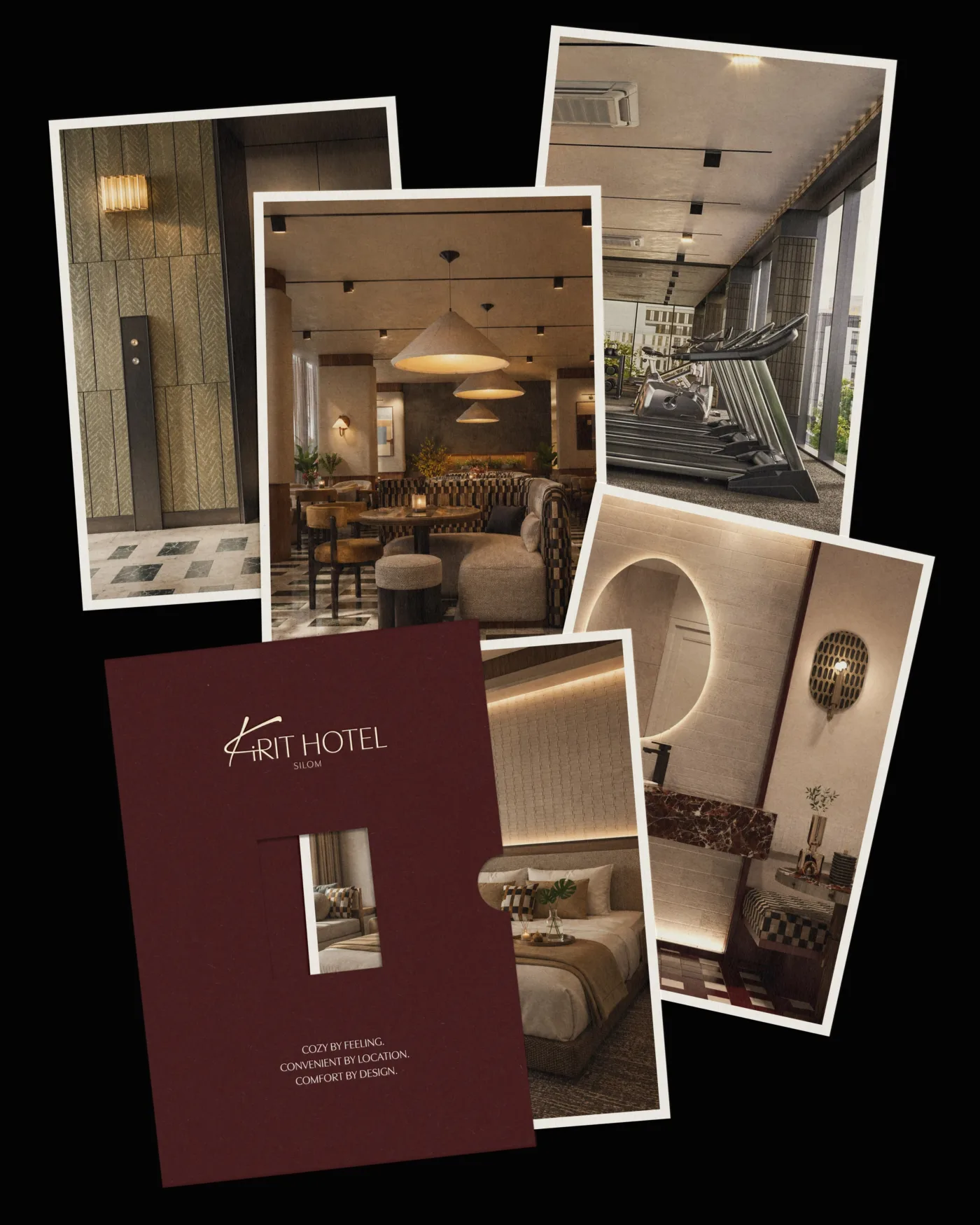
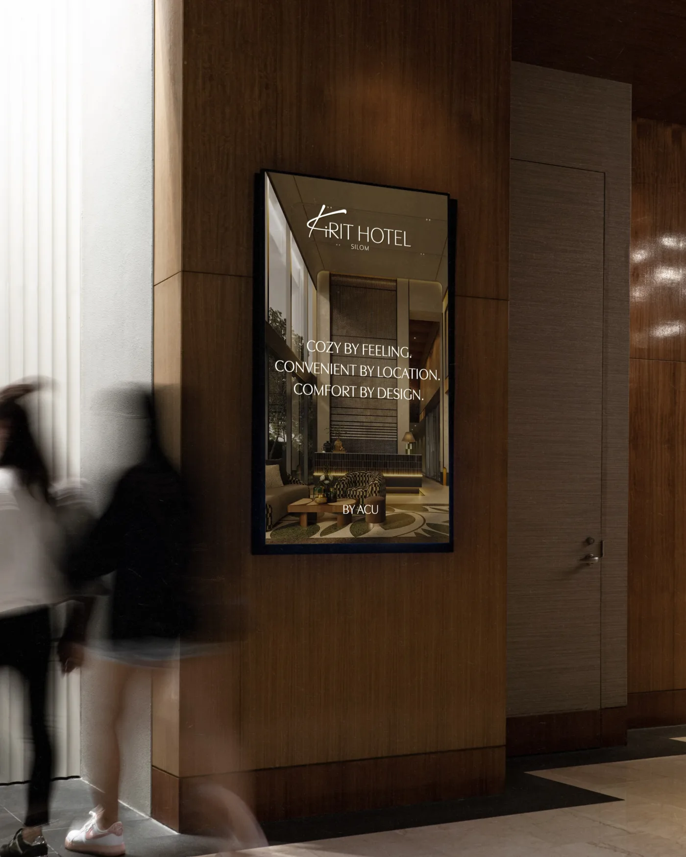
The warm burgundy and olive palette is inspired by the space itself, from the rich fabrics to the carefully sourced details throughout the interior.
A brand inspired by where it all started.
Agency: MIUX Studio • Instagram: @miux.studio